[WIP] Art Process: Angine de Poitrine
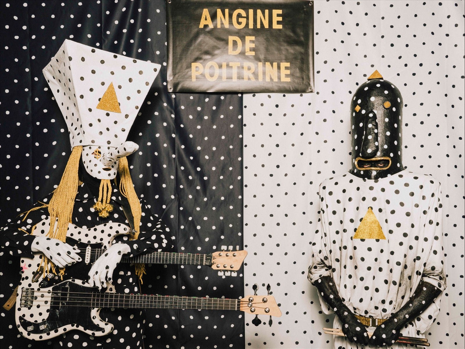
![[WIP] Art Process: Angine de Poitrine](https://storage.ghost.io/c/6b/95/6b953ef9-e0d4-44ca-8334-adf5ac03f08a/content/images/size/w1200/2026/06/adp-1-1.png)
My first encounter with the Quebecois microtonal math rock band Angine de Poitrine was stumbling upon their album 'Vol. II' on the Bandcamp best sellers list. They were number one and had a curious album cover of two weird humanoids on a double-necked guitar and drums so I was a little intrigued (though actually admittedly really weirded out by the guitarist's long nose – there was something in my brain signaling to me that this something did not like it). I don't remember which song I chose to sample or if it was more than one, but all I know is I dipped out pretty quickly. It wasn't even that I thought the music was bad, I distinctly recall being solidly "whatever" about it actually, but I decided it wasn't worth more of my time.
I don't remember how soon it was after this that YouTube suddenly began recommending me videos of Angine de Poitrine's (from here on out referred to as AdP) performance on KEXP, maybe only a couple days. But for starters, my entire home page of YouTube is typically only black metal albums, process videos of painting portraits, and occasionally some shorts from the one beautytuber I once spent a night binging because I really liked her eyebrows. So, weird suggestion right off the bat. The second thing that immediately struck me was the thumbnail, which was of their guitarist who goes by the name Khn (presumably pronounced 'Khan'). He deadass looked exactly like the guitarist on the album cover, long nose and all.
Something you need to know about me is that I absolutely love a good gimmick when it comes to musical artists. Out of what I would consider my top 5 bands of all time, at least as of writing this post, every single one has a bit, stage personas, etc.:
- Lady Gaga – I will argue that her entire persona is her gimmick or appeal.
- Ghost – Satanic pope, band members are his "nameless ghouls". Papa Emeritus reinvents himself for every album cycle, and the band has an overarching or meta story into which each album plays a part.
- Antrisch – In their own words, 'a musical & lyrical expedition to the heights of the world and the depths of man'; each album covers a different real-life expedition that went wrong, and the band dresses their part for each album cycle to fit the theme.
- Panzerfaust – Their most recent tetralogy, at least, examines the horrors of man (primarily war); they have stage costumes insofar as they slather themselves with dirt – and there's also their member Goliath.
- Welle:Erdball – Almost all songs are written using a Commodore-64 sound chip (at least as of their release 1000 Engels – I have not kept up with the band after this release), and their C-64 is considered a member of the band. They also have stage personas and corresponding costumes which remained mostly the same until the departure of A.L.F., one of the two founding members. But it doesn't matter because I stopped listening to their newer material several years before this.
The reason I'm spelling this all out is that the moment I saw that thumbnail of Khn in full costume, I became very intrigued. It instantly renewed my interest in the band. So, I watched their performance of their song 'Fabienk' – and I really suggest that you should watch it, too:
I was sold.
Motivation & Inspiration
What compelled me to create this piece was the same inspiration and muse for every single piece of artwork I create: Music. There is nothing in this world that drives me to create visual art like my favorite music does. Not even other art, nor photos, nor other visuals. (I have my theories as to why, but that is for its own post.) My favorite subjects of many, many of my works are often the musicians themselves whose music inspires me.
I've been making fan art of my favorite music acts since my early teens; my work has been seen by several of these artists and has won fan art contests, been used as one band's default Facebook picture (that one I found out by surprise when I checked their page), and even made the cover of an international publication (Classical Guitar magazine). It's my way of showing my appreciation for what these artists have created and shared, and in a way it fosters an even deeper connection for me to their music. And not just because I tend to play their music on a loop for tens of hours as I draw and paint. 😊 It seems it was only natural that an act with such a tightly intertwined relationship of visuals and audio as AdP would spark my creativity.
Medium
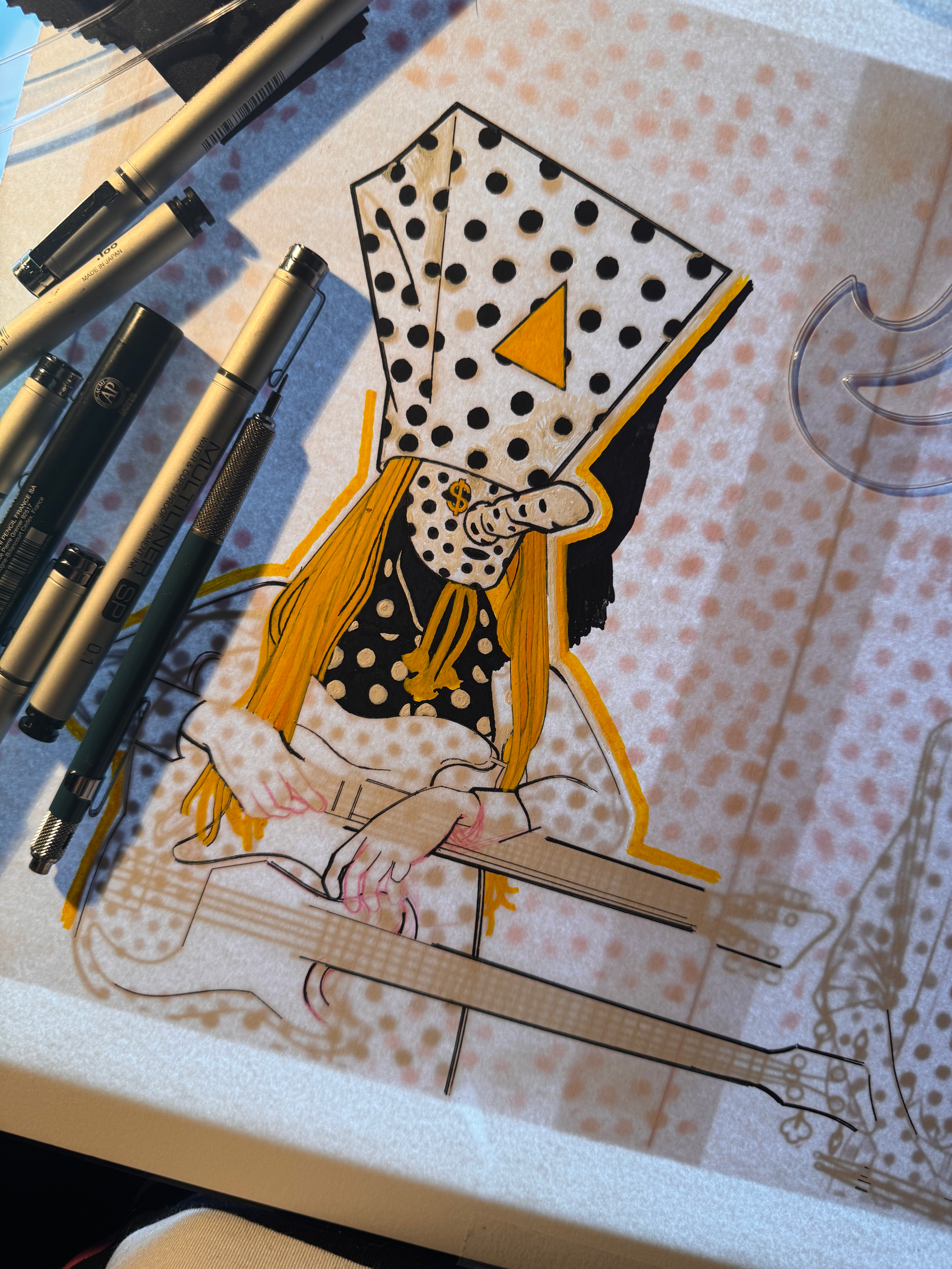
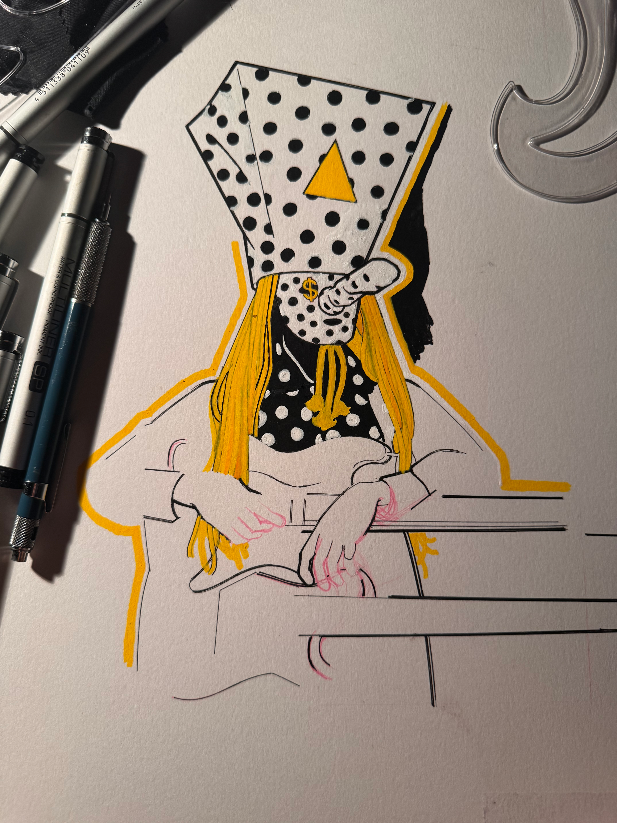
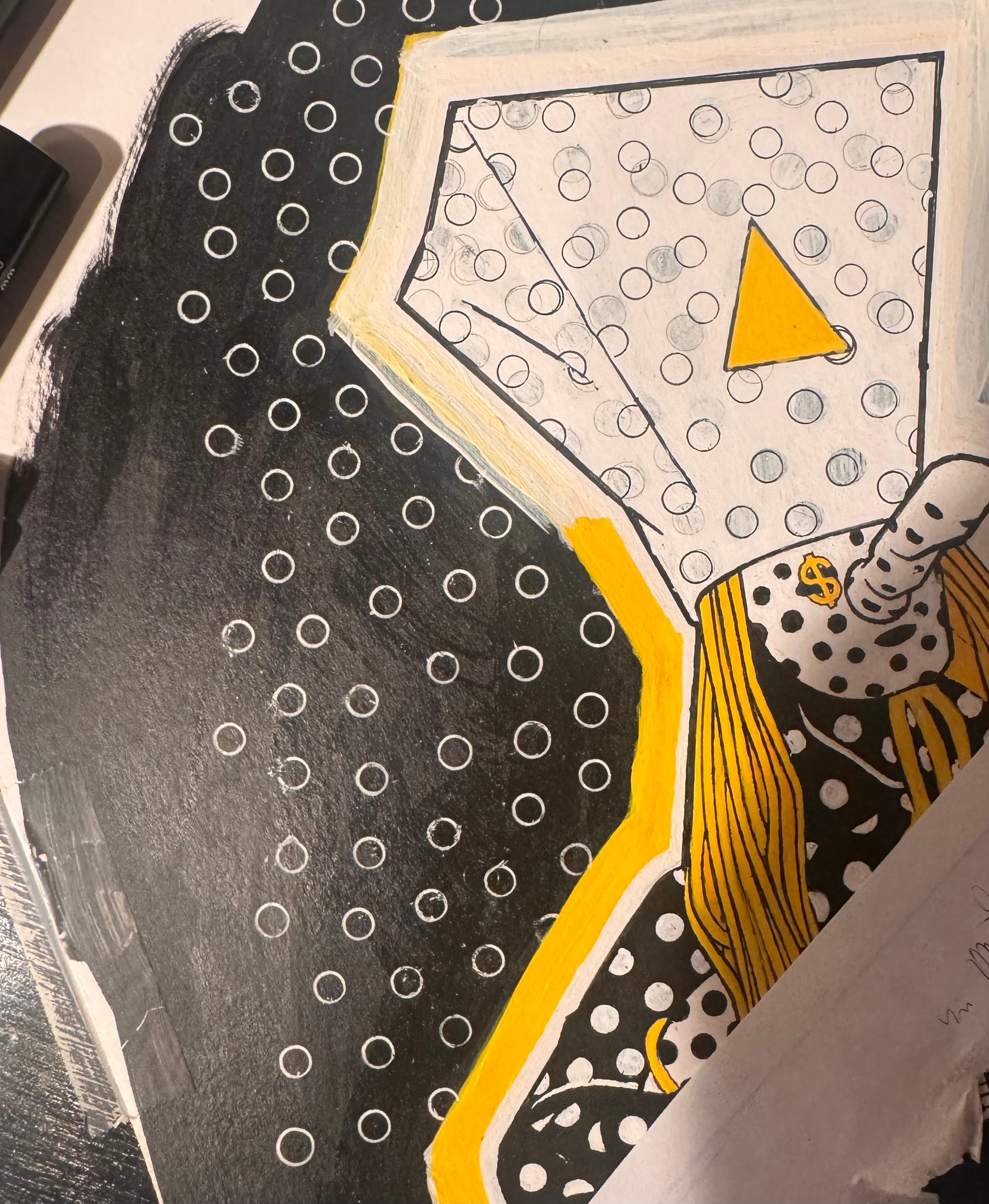
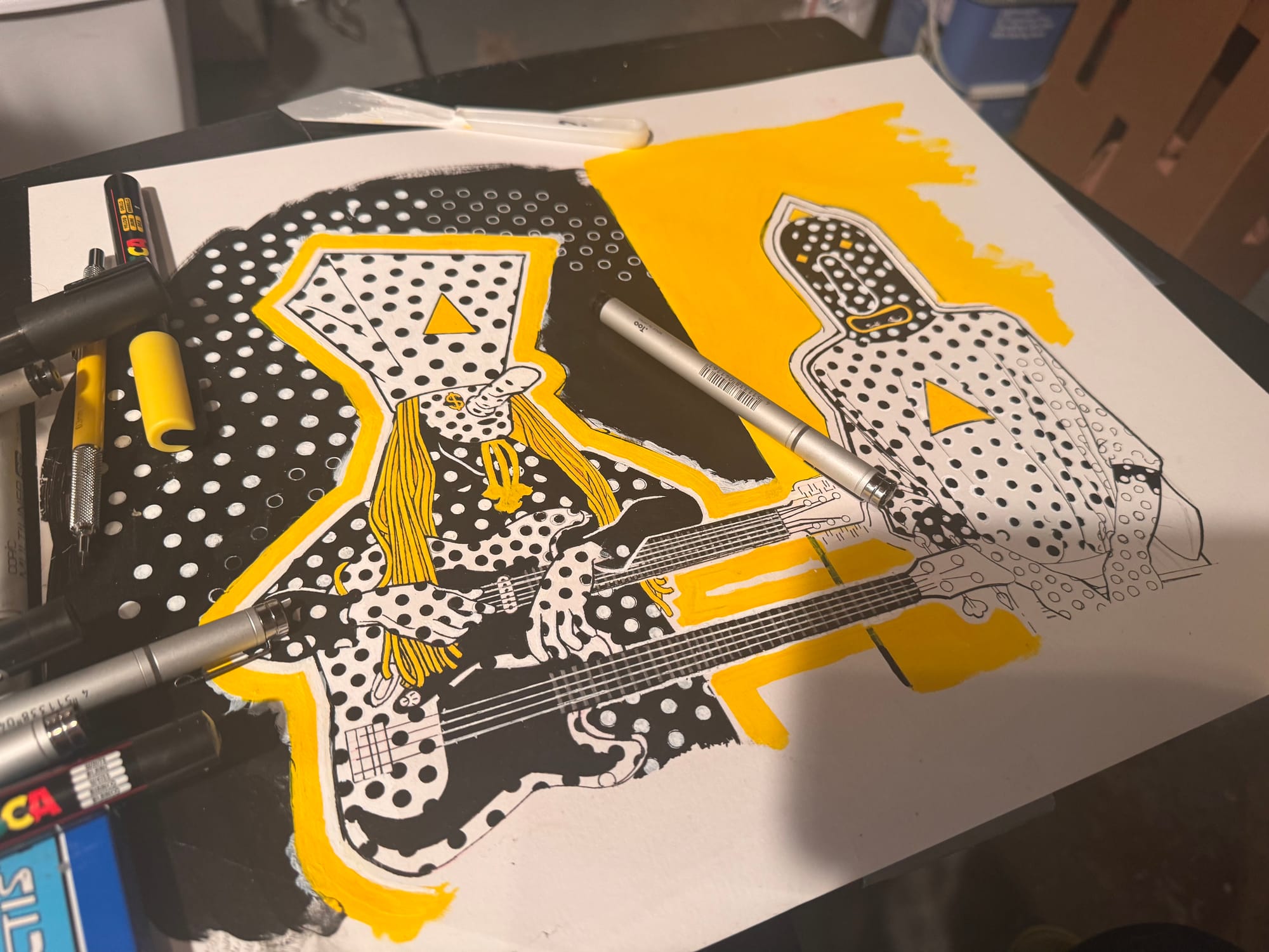
It also just so happened that in March I decided to treat myself to a new medium: Posca Markers (more about these in a moment). I've seen a lot art and designs across my social media lately that were created using Posca markers, and I found myself really drawn to their characteristically crisp line art and bold colors. I was looking for an excuse to make something using them. And it was in seeing other pieces of AdP fan art that I realized their black-white-gold color scheme was perfectly suited for Poscas. I envisioned little rendering, but rather that the piece would be almost entirely blocked-in colors.
The reason art produced using Poscas tends to have a bold, painterly, high contrast look is because Poscas are paint markers, specifically acrylic. I don't know what it is about Poscas in particular that really took off in the past couple of years – they've been around since the early 80s. But Poscas (and other paint markers) differ from regular, alcohol-based markers primarily in that they can be layered over one another opaquely, a property shared with acrylic paint. In other words, it is entirely possible to put down a layer of solid black and then draw over that once its dry with a white Posca, a property or technique that is impossible with alcohol-based markers.
Reference and Initial Sketch
The reference image I chose for this piece was an impulse choice. I did a quick Google image search for AdP and picked the first promo picture that caught my eye. It coincidentally ended up being a behind-the-scenes shot of AdP from their aforementioned KEXP set, which I feel was kind of appropriate given that this was the performance that sold me on their act.
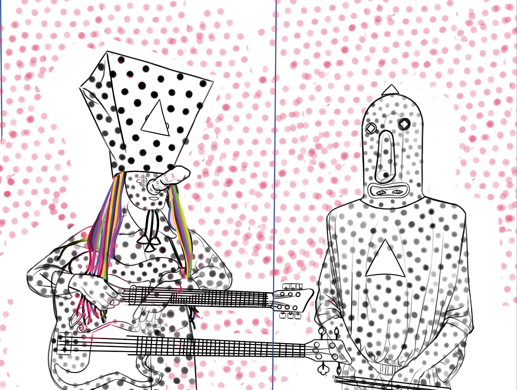
My first order of business when creating a portrait or an illustration from a specific reference image like I am with this piece is to make an initial pass at a line art drawing of the subject(s). I deliberately opted to create this initial drawing on my iPad Pro, and the reason why is that the way I construct figures is extremely messy. Lots of guidelines, generally sketchy lines all over, and erasing and often redrawing entire portions (sometimes multiple times). I'm a little self-conscious about this stage of the drawing process because it can be rough.
If I were to go about drawing directly on the canvas with pencil, it would quickly mar up the surface. There's only so many times you can go over the same spot in pencil before it doesn't erase cleanly anymore, if at all, instead leaving behind ghosts of guidelines that can affect the way your medium of choice applies to and appears or adheres on the canvas.
This is one of the most time consuming parts of the entire process, but also a total blast. There's nothing I love more than beginning with a solid white canvas and watching my drawing progressively take shape, appearing out of nowhere before my eyes. Damn, drawing is so fucking cool.
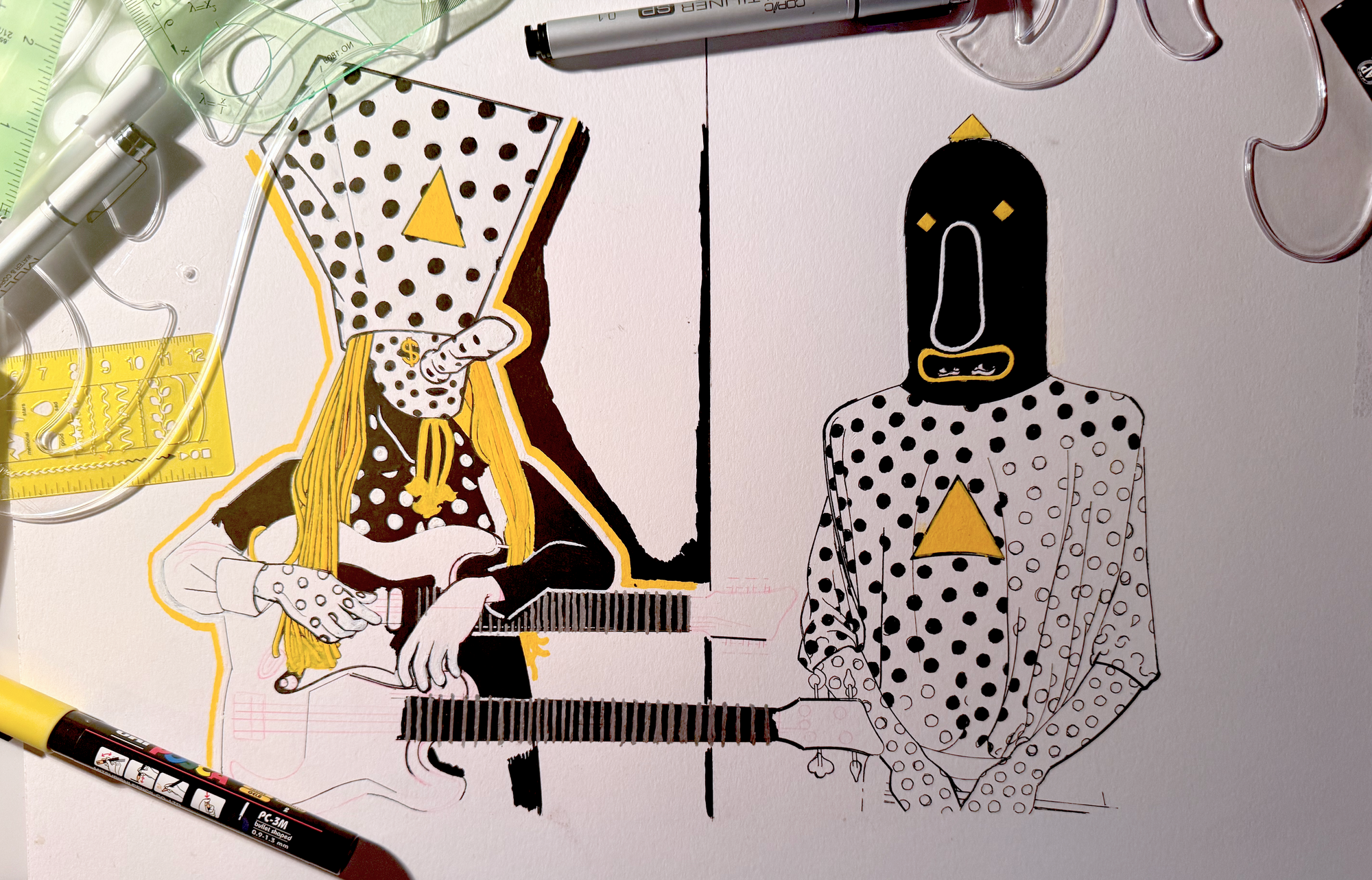
Below is the cleaned up, final line art drawing I created in Clip Studio Paint – my preferred art app – on my iPad Pro. All the weird whitespace with the dots in the background is due to my shifting around the final figures to position them differently relative to each other until I was happy. At the time, I was worried that if I didn't include dots at this stage that I would mess up the spacing free-handing them in the final piece. It actually turns out they were entirely unnecessary and free-handing was , but I'll get to that later. Note that Khn's hair is technicolored because it was easier to get the lay of his dreads just right if I painted each of them over one another with a thick line brush vs. trying to outline each individual dread and eyeball it.
Now, to reveal the secret of how to transfer this initial drawing to the canvas itself. I decided to do this piece on 14" x 17" Strathmore Bristol 300 Series vellum paper. This was mostly because that was what I had available in my art cabinet, but I tend to like vellum paper because it's very smooth and – despite being labeled as intended for dry media only – can handle wetter mediums, such as paint, without warping (to a degree, anyway... you still wouldn't want to drench it with paint that is too watered down).
To scale my initial drawing to my desired size for the final piece, I printed it in two halves on regular computer paper and then taped them together. I then taped that to my trusty Huion light box, which I think is literally just a bright white LCD screen. They don't make the particular light box I have anymore, but there are plenty of cheap alternatives on Amazon. Seriously, I can't stress how nice it is to have one of these for traditional art.
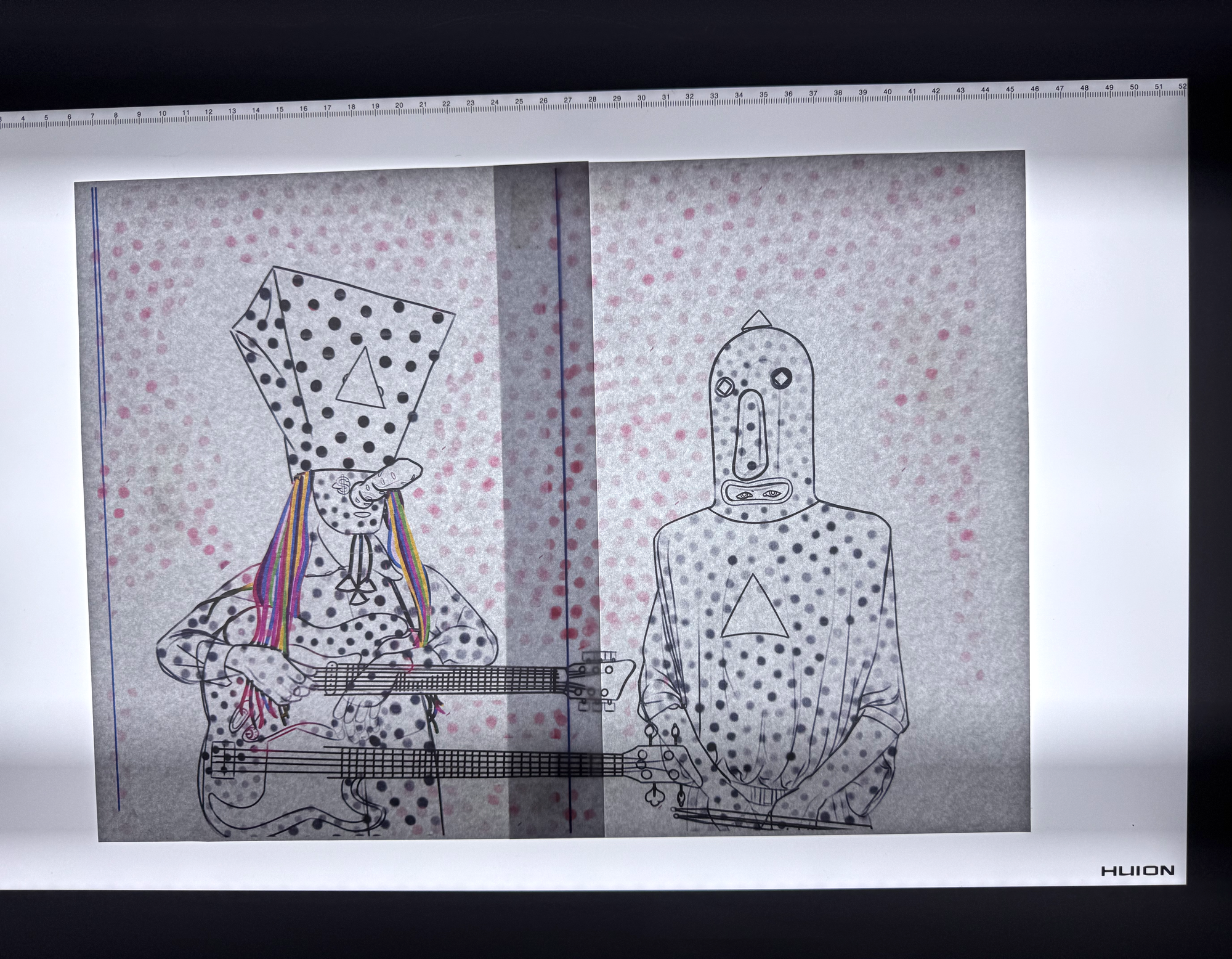
I laid a piece of the vellum over this and secured it to the light box using painter's tape, so that it wouldn't tear the paper when removed from the finished piece. The reason to tape everything down is probably obvious, but it's so the vellum would stay in place over the line art as I worked. The other nice thing about vellum is that while it is thick, it isn't so thick that light can't pass through it.